Before & After Website Revamp: What Changes Matter Most
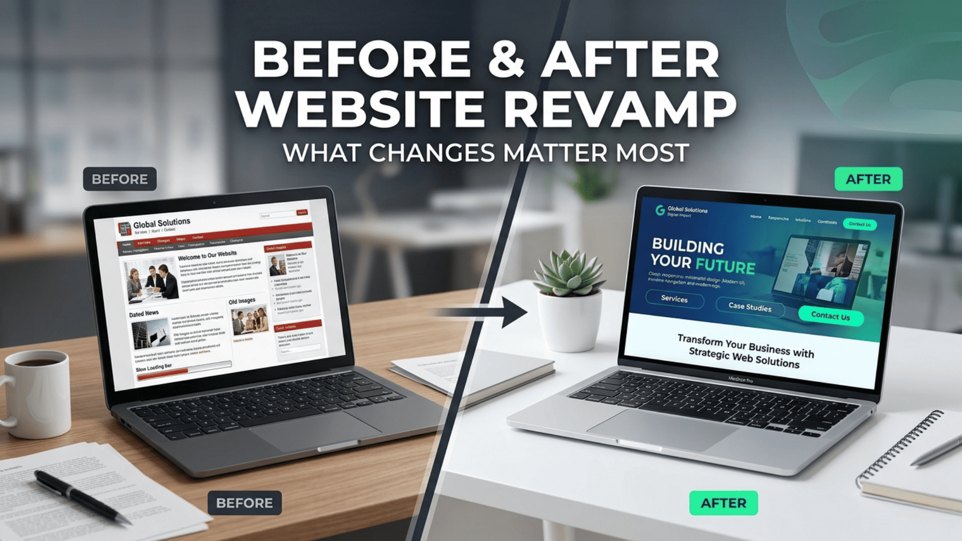
Revamping your website can feel like a daunting task, but the right changes can transform your online presence. An engaging website is crucial; 94% of first impressions are related to design, according to a 2026 study by HubSpot.
Introduction
Revamping your website can feel like a daunting task, but the right changes can transform your online presence. An engaging website is crucial; 94% of first impressions are related to design, according to a 2026 study by HubSpot.
Many businesses overlook critical elements during a redesign, resulting in missed opportunities. Key areas to focus on include:
- User Experience (UX): Streamlining navigation can significantly enhance user engagement.
- Mobile Optimization: With over 50% of web traffic coming from mobile devices, ensuring a responsive design is non-negotiable.
- Content Quality: Updating your content can boost SEO rankings and keep visitors coming back.
Consider the case of a local bakery that revamped its website. By simplifying its menu navigation and enhancing its mobile experience, they saw a 30% increase in online orders within the first month.
Focus on these vital changes to ensure your website revamp is not just visually appealing but also functional and user-friendly.
Understanding the Need for a Website Revamp
Identifying the need for a website revamp is crucial to keeping your online presence relevant and effective. Several key indicators can signal that it's time for an update:
- Outdated Design: If your website looks like it’s from the early 2000s, it may turn visitors away. A modern design can enhance user experience significantly.
- Poor Performance: Slow loading times can frustrate users. According to a 2024 survey by Statista, 47% of users expect a web page to load in 2 seconds or less.
- Mobile Responsiveness: With over 54% of web traffic coming from mobile devices, ensuring your site is mobile-friendly is essential.
- High Bounce Rates: If users are leaving your site quickly, it may indicate that the content is not engaging or relevant.
Pro Tip: Conduct user testing to gather feedback on your current site. This direct insight can help prioritize what changes matter most for your audience.
For example, an e-commerce site that revamped its user interface saw a 30% increase in sales after implementing a cleaner design and improving navigation. These changes not only attract more visitors but also convert them into customers.
Evaluating Current Website Performance
Evaluating your current website performance is crucial before making any changes. Start by analyzing key metrics to identify areas needing improvement.
- Traffic Sources: Use tools like Google Analytics to see where your visitors come from. Are they finding you through organic search, direct visits, or social media?
- Bounce Rate: A high bounce rate may indicate that visitors aren’t finding what they expect. Aim for a bounce rate under 40% for optimal engagement.
- Page Load Speed: According to a 2024 survey by Statista, 47% of users expect a website to load in two seconds or less. Tools like GTmetrix can help you measure your site speed.
Consider conducting user surveys to gather direct feedback. For example, a case study of an e-commerce site showed that after implementing user feedback for layout changes, their conversion rates increased by 25%.
Pro Tip: Create a baseline report of your current metrics. This will help you measure improvement after your revamp efforts.
Identifying Key Areas for Improvement
Identifying key areas for improvement is essential to ensure a successful website revamp. Start by analyzing the current performance metrics to pinpoint weaknesses.
- User Experience (UX): Look for high bounce rates or low engagement time. Tools like Google Analytics can help identify these issues. For example, a local bakery increased customer retention by 30% after redesigning their site for easier navigation.
- Content Quality: Evaluate if your content aligns with user intent. Use search queries to identify gaps. A financial advisory firm improved their organic traffic by creating detailed guides based on common customer questions.
- Mobile Optimization: With over 54% of web traffic coming from mobile devices, ensure your site is mobile-friendly. A responsive design can significantly enhance user experience and increase conversions.
- SEO Best Practices: Review on-page SEO elements like meta tags, headings, and image alt texts. A small e-commerce site tripled its sales after optimizing product descriptions for search engines.
Pro Tip: Conduct user surveys or A/B testing to gather direct feedback, which can provide valuable insights into what needs improvement.
Design and User Experience Enhancements
A website revamp can significantly enhance design and user experience, making it crucial to focus on key elements.
- Visual Hierarchy: Prioritize information through size, color, and layout. For example, large headers and strategic white space can guide users without overwhelming them.
- Mobile Responsiveness: With over 50% of web traffic coming from mobile devices, ensure your site adapts seamlessly to different screen sizes. Sites like Starbucks have effectively optimized their mobile experience to drive engagement.
- Improved Navigation: Simplifying navigation can drastically reduce bounce rates. Implement a clear menu with categorized sections, making it easy for users to find what they need in just a few clicks.
- Interactive Elements: Adding features like sliders or tabs can enhance engagement. For instance, Nike uses interactive design to showcase product features dynamically, keeping users interested.
Pro Tip: Conduct A/B testing on new design elements. This allows you to see what resonates best with your audience and refine your approach accordingly.
Improving Site Navigation
Improving site navigation is crucial for enhancing user experience and retaining visitors. A well-structured navigation system helps users find what they need quickly, which can lead to improved conversion rates.
- Simplify your menu: Limit top-level menu items to 5-7 options. This prevents overwhelming users. For instance, a local bakery revamped its website by reducing its menu categories from 12 to 6, resulting in a 30% increase in orders.
- Use descriptive labels: Instead of generic terms like "Products," opt for specific labels such as "Organic Breads." This clarity helps users understand where to click next.
- Incorporate breadcrumbs: Breadcrumbs improve navigation by showing users their current location within the site hierarchy. A travel agency that added breadcrumbs saw a 20% decrease in bounce rates.
- Mobile optimization: Ensure your navigation is responsive. A mobile-friendly design allows users to navigate seamlessly on any device, which is vital as mobile traffic continues to rise.
Pro Tip: Conduct user testing to identify any pain points in navigation. Real user feedback can highlight areas for improvement that you might not notice on your own.
Implementing Responsive Design
Implementing responsive design is crucial for enhancing user experience across devices. A responsive website automatically adjusts its layout based on the screen size, ensuring that visitors have a seamless experience whether they’re on a mobile, tablet, or desktop.
- Mobile First: Start designing for the smallest screens first. This approach helps prioritize essential content and features. For instance, the online retailer ASOS saw a significant increase in mobile conversions after adopting a mobile-first design.
- Fluid Grids: Use relative units like percentages instead of fixed pixels for layout components. This flexibility ensures elements resize proportionally.
- Media Queries: Implement CSS media queries to apply different styles based on device characteristics. For example, larger images can enhance a desktop experience, while simpler layouts may benefit mobile users.
Pro Tip: Regularly test your website on various devices and screen sizes using tools like Google’s Mobile-Friendly Test. This ensures that your design remains effective and user-friendly across all platforms, leading to higher engagement and lower bounce rates.
Content Strategy and SEO Optimization
A robust content strategy is vital for any website revamp. Start by defining your target audience and their needs. Conduct keyword research to uncover high-value terms and phrases that resonate with them. Incorporate these strategically into your content to improve visibility.
Pro Tips:
- Use tools like Google Keyword Planner or Ahrefs for keyword insights.
- Create buyer personas to tailor your messaging effectively.
Content should be engaging and informative. Utilize various formats such as blog posts, infographics, and videos. For instance, a brand revamped their blog from static posts to dynamic video content, resulting in a 50% increase in engagement.
Optimize your on-page elements:
- Meta titles and descriptions: Ensure they include target keywords.
- Header tags: Use H1, H2, and H3 tags correctly to structure your content.
Regular audits of your content performance can provide insights for continued optimization. Monitor analytics to understand what resonates with your audience and adjust your strategy accordingly. Keep evolving to stay ahead in SEO rankings and audience engagement.
Refreshing Content for Relevance
Refreshing content regularly is crucial for maintaining relevance and engaging your audience. Outdated information can hurt your site's credibility and SEO performance.
- Update key statistics: Replace old figures with the latest data. For instance, if your blog mentions social media usage, include the most recent stats from sources like Statista or Pew Research.
- Optimize for current trends: Align your content with trending topics. For example, if remote work is a hot subject, incorporate insights about how to manage teams effectively in that context.
- Enhance readability: Break up long paragraphs and add bullet points for easier reading. This improves user experience and keeps visitors on your page longer.
- Incorporate multimedia: Add relevant images, infographics, or videos to make your content more engaging. Visual elements can improve understanding and retention.
Pro tip: Set a reminder to review and refresh your content at least every six months. This practice not only enhances SEO but also signals to your audience that you are a reliable source of current information.
Optimizing On-Page SEO Elements
Optimizing on-page SEO elements is crucial during a website revamp. Focusing on these elements can significantly enhance your visibility in search engine results.
- Title Tags: Ensure each page has a unique title tag that includes primary keywords. Aim for under 60 characters for optimal display in search results. For example, “Best Vegan Recipes for 2024” is clear and concise.
- Meta Descriptions: Craft compelling meta descriptions that summarize page content and include keywords. Keep it under 160 characters. A well-written meta can improve click-through rates; for instance, “Discover delicious vegan recipes with fresh ingredients, perfect for any occasion.”
- Header Tags: Use header tags (H1, H2, H3) to structure content clearly. H1 should contain your main keyword and be used only once per page. Subheadings (H2, H3) help break up text and improve readability.
- Image Alt Text: Add descriptive alt text to images, incorporating relevant keywords. This not only aids SEO but also improves accessibility. For example, “bowl of creamy vegan pasta” is descriptive and keyword-rich.
- Internal Linking: Enhance user experience and SEO by linking to other relevant pages on your site. This keeps visitors engaged and helps search engines understand site structure.
Pro Tip: Regularly audit your on-page elements after a revamp to keep content fresh and aligned with current SEO standards.
Technical Improvements for Better Performance
- Optimize Images: Large images can significantly slow down your site. Compress images using tools like TinyPNG or ImageOptim. For instance, a case study by SitePoint showed that optimizing images reduced load times by 30%.
- Implement Lazy Loading: This technique delays the loading of images and videos until they are needed. It can improve initial page load speed by up to 60%, enhancing user experience.
- Upgrade Hosting Solutions: Consider switching to a managed hosting provider. For example, WP Engine offers excellent speed and support, which can be crucial for e-commerce sites.
- Use a Content Delivery Network (CDN): CDNs like Cloudflare or Amazon CloudFront distribute your content across multiple servers worldwide. This can reduce load times for users no matter their location.
- Minify CSS and JavaScript: Reducing file sizes by removing unnecessary characters can enhance site speed. Tools like UglifyJS and CSSNano can help streamline your code.
- Regularly Monitor Performance: Use tools like Google PageSpeed Insights or GTmetrix to continually assess your site’s performance and identify areas for improvement.
Pro Tip: Regularly update your website’s platform and plugins to ensure optimal performance and security. According to recent trends, sites that maintain up-to-date technology see lower bounce rates.
Conclusion
A website revamp is not just about aesthetics; it’s a strategic move that can significantly impact your business. Key takeaways from our discussion include:
- User Experience (UX) is Critical: Enhancing navigation and ensuring mobile responsiveness can lead to lower bounce rates and higher engagement. For example, a case study by Adobe showed that improving UX resulted in a 200% increase in conversion rates for their clients.
- SEO Matters: Revamping your site provides an opportunity to optimize for search engines. Incorporating updated keywords and improving page speed can boost your visibility. Remember, a 2023 study revealed that 53% of mobile users abandon sites taking longer than three seconds to load.
- Content is King: Fresh, relevant content helps engage visitors and improves SEO. Consider launching a blog or resources section to provide value and establish authority in your niche.
- Analytics Drive Improvement: Use tools like Google Analytics to monitor your site's performance post-revamp. Track user behavior and make data-driven decisions to further enhance your site.
Pro Tip: Regularly update your website to keep up with design trends and user expectations. Set a quarterly review to assess performance and make necessary adjustments.
About the author

Santosh Shet
Santosh Shet is the Founder of Appyminds and a technology entrepreneur with over 20 years of experience in software development, web applications, mobile apps, AI solutions, and business automation. He helps businesses transform ideas into scalable digital products through modern web development, mobile applications, intelligent automation, and AI-powered solutions. Santosh regularly writes about artificial intelligence, software development, digital transformation, SaaS products, and emerging technology trends.